Table of Contents
 Users
Users Groups
 Accounts
 Printers
 Reports
 Cards
Cards Options
 Application Log
 About
AboutThis section will guide you through the main areas of the application and cover some common management tasks.
Before we jump in and start our tour of PaperCut NG it is important to take some time to understand the application's navigation tools. The subsequent sections detail the major user interface elements.
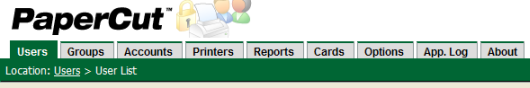
Application areas are grouped into tabs that logically separate parts of the system. Selecting a tab displays the controls and information related to that area. Users will be familiar with the concept of tabs from many other applications.
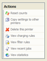
Throughout the application, the Actions area lists a number of tasks or actions that can be performed. The Actions list is always located in the top left-hand corner of the application window. Actions are adaptive and the list of actions changes depending on the area of the application being viewed.
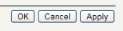
Changes made to options, user settings or configurations are only validated and applied after submitting the change. Screens that you can save in the application will have the following buttons located at the bottom:
- Validate and save the changes and return to this location/object
- Validate and save the changes and return to the data list ready to select and edit another object.
- Don't save and changes.
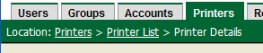
The crumb trail serves two purposes. It maps out the navigation path followed by the user and provides a way to navigate up (back) the navigation path. For example, while editing a user's account, the crumb trail provides a hyperlink up one level back to the User List.
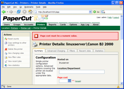
Important status messages are displayed in the top section of the application window. Messages relating to an error or requiring user intervention are displayed in red. Standard messages are displayed in green and cautions in yellow.
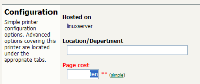
Configuring printers, users or settings are often done via text fields. Changes made to fields are validated after pressing or buttons. If the field fails validation, the offending data is marked with a red asterisk. Typical validation errors include invalid number or currency formats.